About the Client
Decatur Healing Arts is a holistic wellness center with an aim to maintain balance between the four elements (air, earth, water and fire) that sustain life to ensure physical and psychological well-being. Their goal is to create a community-focused inclusive, safe, and brave space for physical, mental, and emotional healing. Decatur Healing Arts has a genuine love for people and are passionate about supporting you on your healing journey.
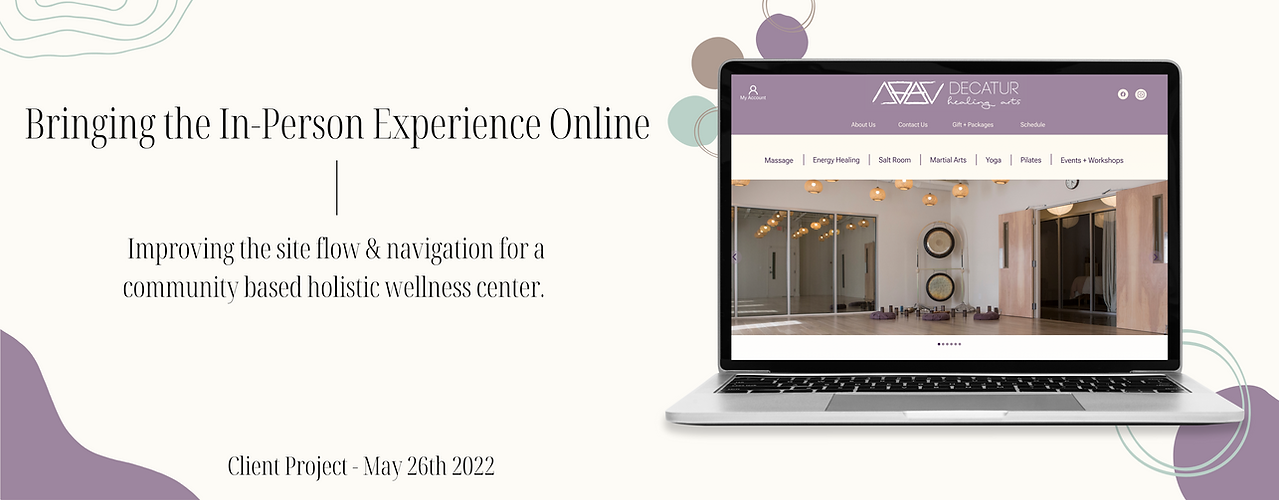
The Decatur Healing Arts family wanted to redesign their website in hopes of increasing new customer acquisition and 1:1 bookings, by reducing the number of inquiry calls about pricing. However, through extensive user research, our team learned that there were other critical roadblocks to booking an appointment online other than pricing conventions.
Duration
3 weeks
My Role
UX Researcher, Design Lead
My Team
Julia Heymans
Victoria Weiss
Tools
-
Figma
-
Asana
-
Optimal Sort
-
Zoom
-
Google Docs/ Sheets
Please enter Full Screen mode to properly view prototype
Process
To better understand the mental model and pain points associated with users when booking a holistic treatment online, we conducted 8 user interviews, usability testings on the current website and collected over 10 card sort activity results. We then took this information, along with data from other research methods, and began to synthesize through affinity mapping and user journeys. During this process we uncovered several root problems associated with the site along with possible solutions.


User Insights
New Customers
-
Users tend to read the reviews of a business before making a decision.
-
Users want all necessary information on a service before booking. Some include:
- Service description
- Benefits of service
- Any materials they will need to bring to their appointment
- Practitioner/s -
Users like to see pictures of the establishment before making a decision.
Existing Customers
-
Most customers find the online booking process to be tedious.
-
Existing customers feel the DHA website does not accurately depict the in person atmosphere/ experience.
-
Some customers feel that the booking and purchasing process is disconnected.
-
Apart from the online booking process, customers find the overall experience at DHA to be great!
Website
-
Users found the website menu structure to be a bit confusing.
-
Users felt the pricing structure was disorganized
-
Users found the booking calendar to be too small and difficult to navigate.
-
The audience found the site in general to be overwhelming.
-
Users feel that testimonials could be very impactful on the website.


Problem
Users need a way to find available service options, understand service details, and an efficient way to place a booking, so that they can make an informed decision and successful booking that makes them feel safe and comfortable.

Solution
By redesigning the main menu navigation, offering additional information about services, such as the benefits and ailments it may help to treat, and simplifying the booking process with clear call to actions, apparent pricing and a larger scheduling calendar, we believe we can create an appointment booking process that allows users to feel comfortable and confident with their booking.
These changes are likely to increase online booking rates, thus increasing customer acquisition.
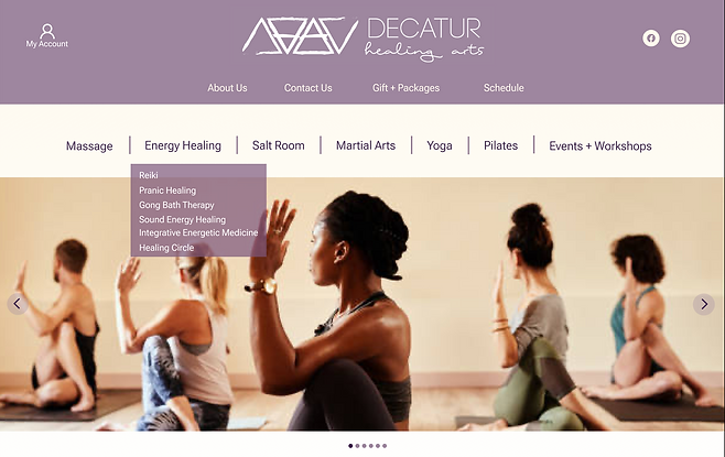
Pictured above is the redesign for the main global navigation; we featured a menu bar with sub-menu dropdown options. We also included a secondary local navigation for items that did not fit amongst the service offerings, such as, About US, Contact US, Gifts+Packages and schedule. This design proved to be more intuitive amongst users, allowing them to easily find and browse the services offered by Decatur Healing Arts.
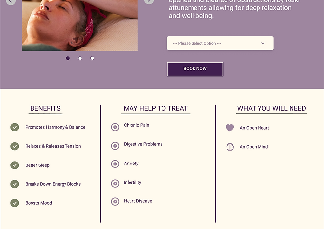
Featured here are columns show casing additional details/ benefits on any particular service. The bullet list format allows for users to easily digest the information without it being too text heavy. This feature provides users with all necessary information up front, thus reducing the number of inquiry phone calls per service.
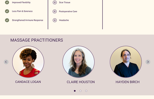
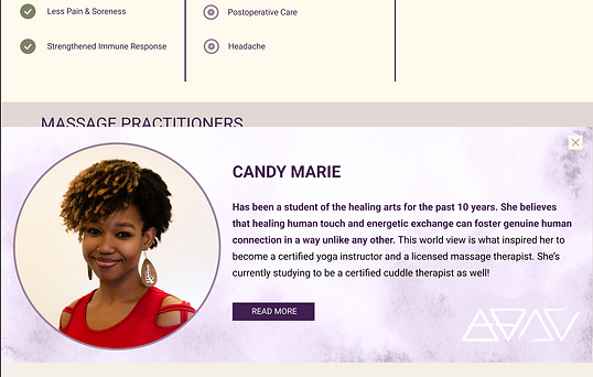
Just below the additional information columns, we have a carousel view of the practitioners specific to that service. When users click on an individual practitioner, an overlay will appear where users can read a bit about them our click out to view their full profile to 'Read More'. This allows users to get familiar with a practitioner allowing them to feel safe and comfortable making their booking.


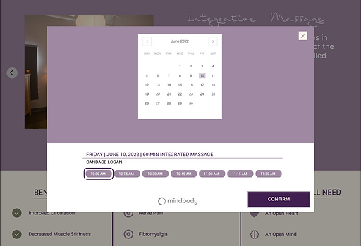
Presented here in image 1 (left) we can see clear call to actions, such as, selecting service options as well ass 'Book Now' . In Image 2 (right) we have displayed all clearly defined pricing options on the description page for any particular service. By including pricing and booking options all within the service description page we can create a cohesive online booking process for customers; unlike the disjointed experience prior where users had to navigate to an entirely different page to view any and all pricing options.
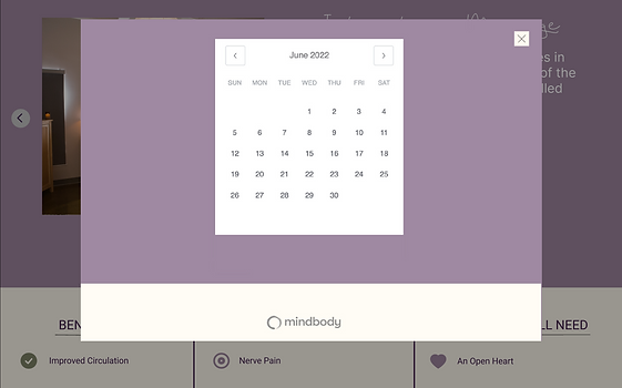
Lastly, but certainly not least, we included a larger booking calendar! Simply stated, with this larger booking calendar, users are able to actually see and click the dates and availabilities of practitioners
Next Steps
-
Tree test to validate suggested changes to navigation from Usability Tests
-
Vet how to best translate these designs most efficiently into SquareSpace
-
Built out content
-
Collect healing stories / testimonials
-
Photoshoot
-
Deploy and measure (site & business analytics)